Sunday, March 10, 2013

American Scene, Precisionist, and Regionalist Painters


Edward Hopper's paintings are somehow uncanny: there's something strange in the atmosphere that his works create, but it still looks familiar... His style is sometimes beyond description, I really loved his paintings!
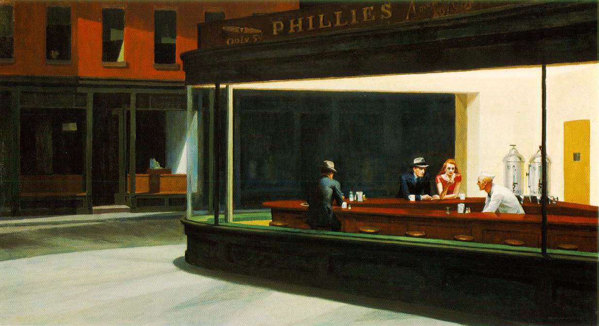
Hopper's 'Nighthawks'

Ben Shahn can sometimes resemble Hopper's work, but I think Shahn is way too disturbing.

Shahn's 'Liberation' ... quite disturbing

Isabel Bishop's paintings are steady and calm; they make your senses relax in a really sublime way!

Bishop's 'Men Resting'

However, Bishop's friend Reginald Marsh is not really my style... his paintings are too disgusting and disturbing!
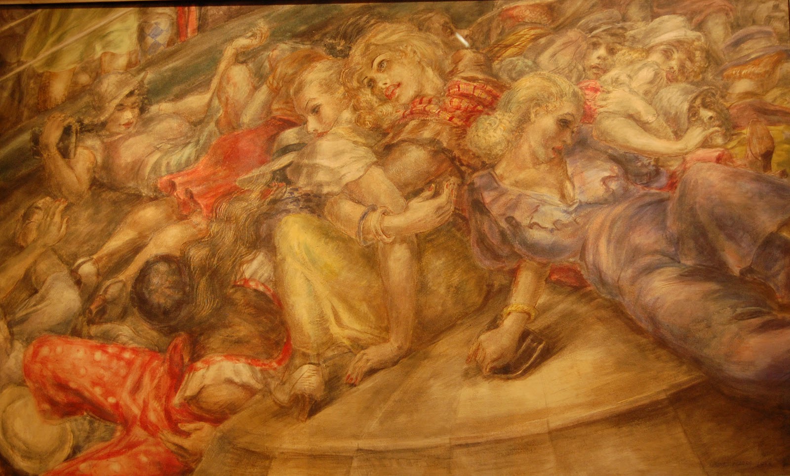
Marsh's 'The Bowl'

Ivan Albright's paintings are indeed really precise: they're busy and overwhelming, sometimes they're even alarming!
Albright's 'Poor Room'

I really liked all Charles Sheeler's pieces of work, but 'City Interior' really impressed me! What a realistic painting! *Hats off*

'City Interior'

Demuth can get really interesting and modern, speacially in 'I saw the Figure 5 in Gold', but he doesn't speak to me like other artists do.
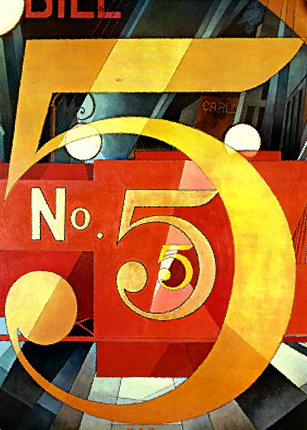
'I saw the Figure 5 in Gold'

In general, I didn't really like the Regionalist paintings because I don't even like farms landscapes or farm animals in real life. However I think that Rockwell Kent's seascapes and polar landscapes ate great! Some paintings that stand out from the rest! In addition, I think that Grandma Moses's paintings are cute, she has a style that I would never paint, but anyway I think her work is cute!

I've always thought that Wood's 'American Gothic' is disturbing..
his other paintings are more charming and stylized, though

Thomas Hart Benton is indeed different from the rest of the American artists we've been reviewing. I liked his paintings because they're energetic and quite imaginative, sometimes even alarming!

Hart Breton's 'Cut the Line'

The Eight and the Ashcan School


The Eight and the Ashcan School painters are not really aesthetically similar from one another and thus, the reactions to their work should be done individually for each member:
Robert Henri's work doesn't give too much to talk about. I think it is great that the chose to portray not only celebrities or 'important' people, but normal citizens that were around him; he showed the world the faces of America! If you're looking for paintings that portray a certain period of American History for your sociology class, these are the ones you should be looking for. However, I didn't really like his style or technique... I think his paintings are not really special (aesthetically and stylistically speaking).

Henri's 'Willie Gee'

William Glackens, George Luks and Everett Shinn  all portrayed the glorious and innovative city of New York, and I guess they were trying to express their love to their city; nevertheless, they didn't make New York look like an inviting or amazing place; they give the city that never sleeps a somber look that did't please me at all! (I have to point out that Luks' black bear sketches are great and Shinn's style is somehow more appealing to eye even if it doesn't make New York look in its best shape)

Glackens' 'East River Park'


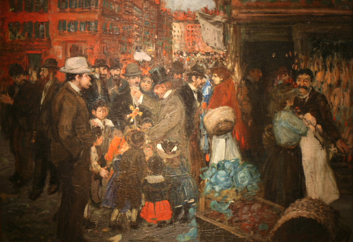
Luks' 'Street Scene'

Shinn's 'Washington Square'


John Sloan's paintings, in my opinion, portray much more interesting scenes than any Glackens', Luks' or Shinn's works.

Sloan's 'Pigeons' reminds me of a scene of Mary Poppins


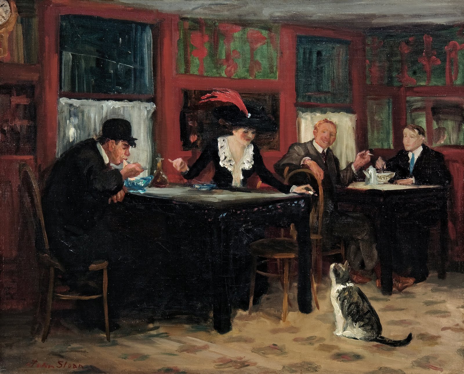
This cat steals 'Chinese Restaurant'


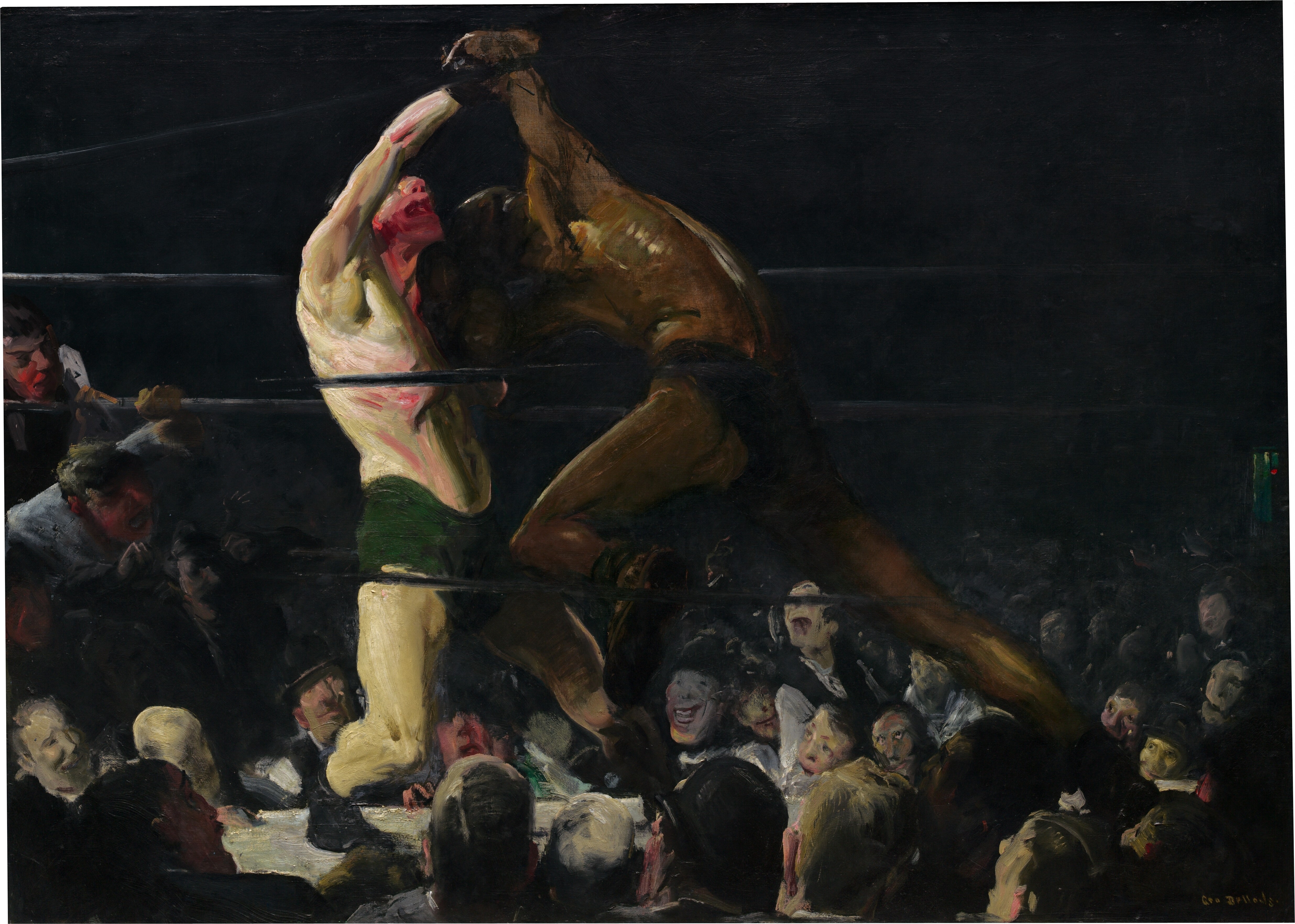
Finally, I think that George Bellow made the most interesting work -even if he wasn't really a member of the Eight- because he used various styles and techniques, and even though the subject matters of his paintings don't differ a lot from the works  the rest of the members, Bellows seems to me more spontaneous and creative.

Bellow's 'Both members of the club'

'Blue Snow, The Battery'

Tuesday, March 5, 2013

Vorticism in the Visual Arts

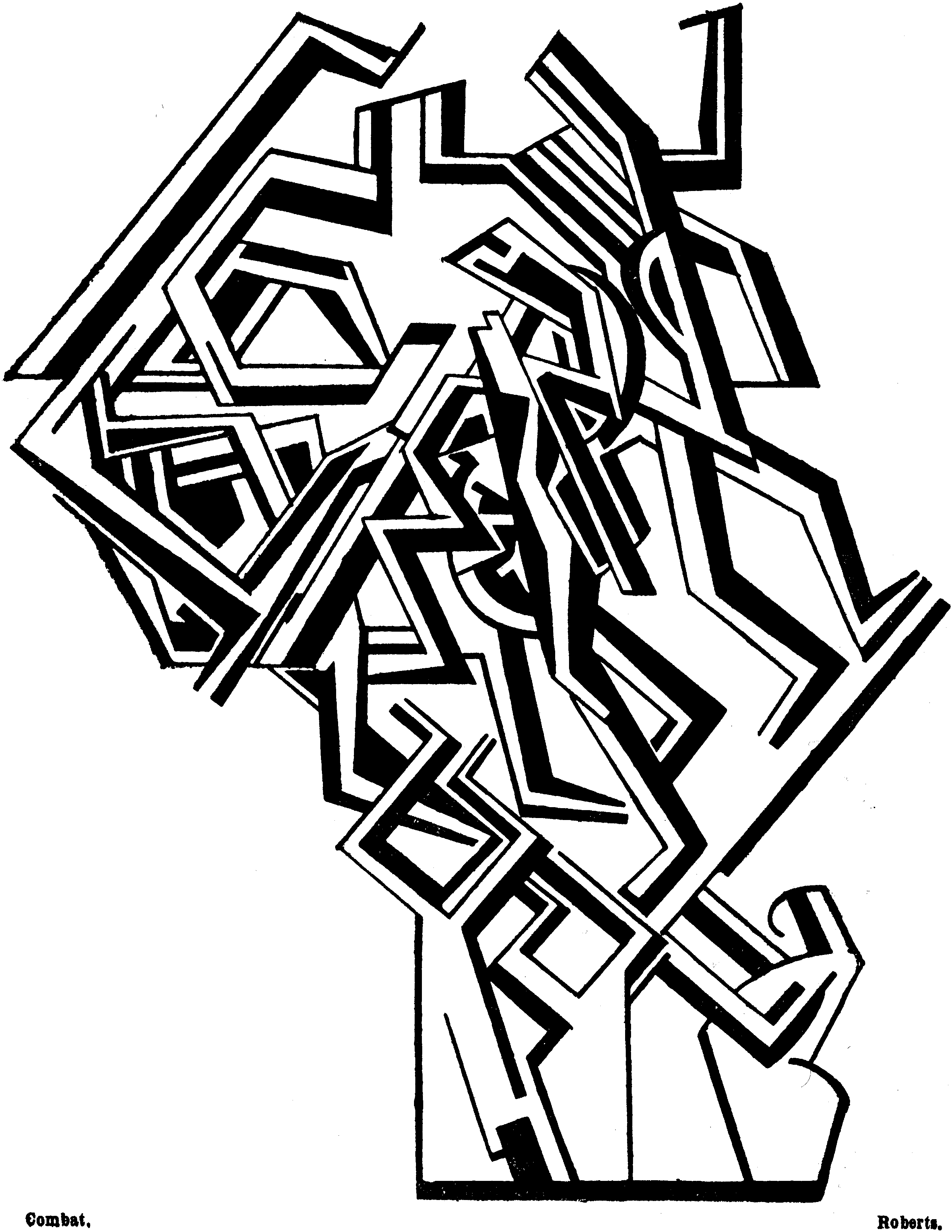
Vorticism in all painting, photography and sculpture are really impressive! The compositions are really busy and violently energetic, yet harmonious. It is really amazing how artist could get so much work done out of simple lines!
In painting, I think black and white compositions are more striking to eye than any other colour scheme paintings (specially the chalky colours); however, paintings that form a complete sort of landscape just out a compilation of straight lines are really amazing! 
Vortographs, or Vorticism photographs are really interesting. Sometimes, they look painting-like, but some other times, they just seem to be some computer edited photographs (I think that if I had look at them out of context I I'd just had thought that they were another Hipster edited photo -which are kind of annoying nowadays-).
I think the sculptures related to Vorticism are great spatial translation of the Vorticist paintings and photographs. However, in Sculpture, the subject-matters are more obvious or recognizable (they even get erotic sometimes!)


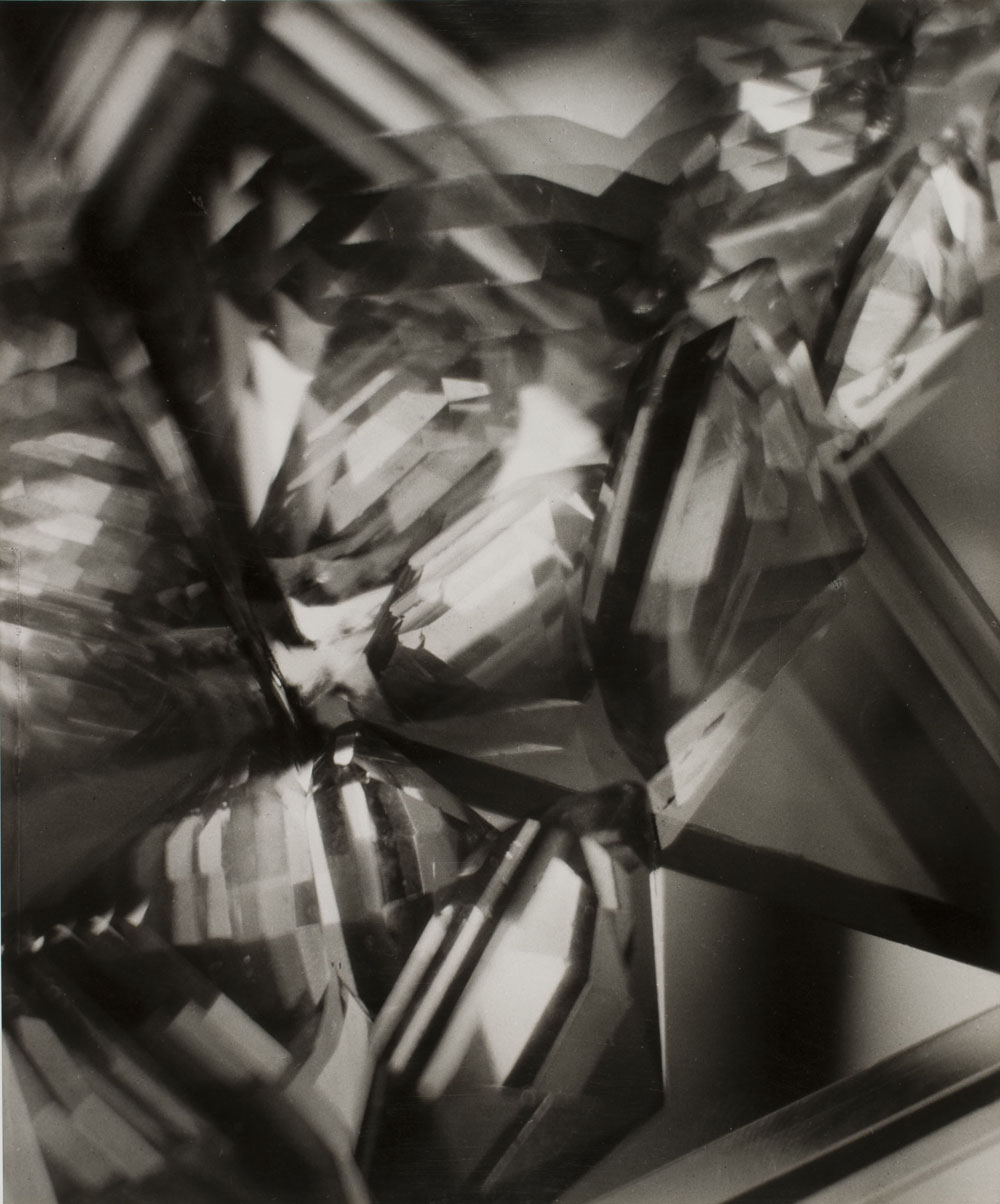
Vortograph

Vortograph


The Growth of European Abstraction

I really really like European Abstraction! Each composition features not only some great recognizable techniques, but a really interesting management of shapes and colour. We can easily find a relation between Der Blaue Reiter we saw on Expressionism in some European Abstraction works, specially because of the composition of the colours and the overall atmosphere created by the paintings. I think that European Abstraction paintings are actually really entertaining to watch!
As in Der Blaue Reiter, I have some chosen favourites in European Abstraction:
In my opinion, the Russian Wassily Kandinsky is by far the most creative of all. His paintings are not only harmonious, bur energetic and really attractive to the eye -I actually set one of his compositions as a wallpaper for my computer-.
A great Kandinsky's!

We can easily observe Der Blau Reiter influence on this Kandinsky


My favourite Kandinsky's

Hilma af Klint's compostions are really beautiful and subtle. I really like the shapes and colours she uses (they are surely really feminine, but powerful); I would definitely like some of her designs on my bedroom's walls!

Hilma af Klint's paintings
Sonia Delaunay's fashion and car designs are something I wasn't really expecting! I guess it is because fashion and car designs are not usually considered a proper form of art. However, I really liked them, I found them ridiculous but somehow charming!


Kupka's abstract paintings are also subtle and charming! They look vulnerable, tranquil: they bring me peace!
Picabia's 'Lausanne Abstract' immediately reminded me of  the drawings shown on 'Le Petit Prince' and in 'Madeline', and Baumeister's 'Kosmische Geste' seems to me a less cheerful Miró painting:

'Lausanne Abstract'
'Le Petit Prince'
'Komische Geste'
Miró's painting


De Stijl

De Stijl is certainly a peculiar art movement. Even though, all Stijl compositions are made out of straight plain lines, basic geometric figures and only primary colours, I found them delightful and complex, and even somehow sentimental. Van Doesburg's,  van der Leck's and Mondrian's paintings are all similar and recognizably part of the Stijl style, and they all show us how the most simple elements can sometimes create the most sublime and touching works of art.
De Stijl sculptures by Vantongerloo are basically Van Doesburg's,  van der Leck's and Mondrian's paintings in 3D. One could easily think that De Stijl sculpture is easy to do, but I can tell there's a lot of maths and engineering in Vantongerloo's pieces. (I don't understand why most people -at least here in Mexico- think that maths and engineering have nothing to do with art... ha!). Nevertheless  in spite of the level of engineering of some De Stijl designs, sometimes they are rather beautiful than useful -the chair designs, for example, are amazing, yet useless for practical purposes)


Sunday, March 3, 2013

Futurist Music

Well, Futurist music is certainly different. However, this time, I didn't really like art to be different. I found Futurist music annoying and unsatisfying; of course, by the time it was written and performed, machines were kind of new and everyone should have been excited about them, but listening to city and machines noises now is really irritating. Nevertheless, I acknowledge that Futurist 'melodies' are strongly creative, and sort of harmonious (if you like really strong and artificial noises).


The one I enjoyed the most

Russian Silent Film

Sergei Eisenstein's 'Odessa Steps' sequence really shocked me. Certainly, it is a really impressive, cruel and realistic portrait of the Russian Revolution. The montage used in the film truly helps to transmit us the awful feelings of war; I think it really succeeds to capture human's inhumanity. 'Odessa Steps' is a very energetic and emotive sequence I think everyone should be able to watch at least once in their life time.
Alexander Dovzhenko is indeed more lyrical. His use of, for example, some shots of beautiful horses running or some tasty fruits growing in a tree, it's really poetic, and it somehow helps the film to be emotional but no  in a disturbing way (like Eisenstein's films). It seems that Dovzhenko's films have some really deep content that would be really interesting to take a complete look at. 
Dziga Vertov's 'Man with a Movie Camera' is a remarkable composition that, in one way or another, looks more modern than both Eisenstein's and Dovzhenko's films. Even though, 'Man with  a Movie Camera' has no plot, it still is really energetic and entertaining. 
It seems like war is a huge topic on Eastern Europe art. I saw a much more later Polish film 'Kanal' about the Warsaw Uprising and the escape through the sewers to avoid the Nazis... Eastern Europe is certainly an injured zone, and one can easily tell that just by taking a look at their art.